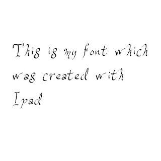
Ipad Font
This is my font i created with the use of iPad. It was much easier than fontstruct because on iPad there was no restrictions on how you created your font and also you could use your fingers to create the font which gave it a more unique style.
Tuesday, 23 October 2012
Fontstruct Font
This is my own digitaly made font made by Fontstruct. the program worked with pixels and you had a variety of shapes to choose from to create your font but restricted you by only using one shape per pixel which made it hard to continue my pattern throughout the alphabet with letters such as N and X and Q.
This is my own digitaly made font made by Fontstruct. the program worked with pixels and you had a variety of shapes to choose from to create your font but restricted you by only using one shape per pixel which made it hard to continue my pattern throughout the alphabet with letters such as N and X and Q.
Digital Caligram
This is my hand drawn Caligram which is scanned into the computer to use on adobe illustrator. The letters had a big font and had to be words related to the object in this case i had a camera so i used words such as focus or flash.
This is the finished Digital Caligram that i created with adobe illustrator. I used the paint bucket in illustrator to colour each word. I used different tones of one colour to add depth and to shows that the object is a camera.
This work was inspired by Oscar Wilson who is widely known for this type of work.
Monday, 22 October 2012
Reviewing Experiments
1. Which materials and techniques have you experimented with during the typography project?
In the typography project I used a whole variety of materials and techniques to recreate our own version of the artist's work we our looking at. I used paints,food,objects and software such as photoshop and illustrator to achieve this.I used food to create words and sayings to see what effect they give on the word and also what it can be used on. I used a variety of paints to paint out expressions in an artisitic form and also see the texture and stroke of the brush. I also used photoshop to create different typography styles by using the wide range of tools photoshop and illustrator have to offer.
2. Have you explored and developed your ideas imaginatively? How have you demonstrated this? (give examples, link to posts or include images)
3. Have you research a diverse range of artwork and completed this on your blog? who have you analysed? is you analysis in-depth? (again give examples and link to posts)
4. Have you explored a range of ideas around the theme of 'Sayings and Expressions' within your experiments? What are they? How have they informed your ideas?
5. Have you refined / developed your outcomes through experimentation? How?
6. Have you annotated, in detail, your experiments and developments on your blog and used this information to help you improve?
7. Which techniques / experiments have been most successful? Why?
8. Which techniques / experiments have been least successful? Why?
9. Which techniques / experiments will you be developing further for your final outcome? Why?
10. What else can you do to further develop the techniques / experiments you want to use for your final outcome?
Sunday, 21 October 2012
Hand Drawn Typography
This is my hand painted typography showing the letter B which is inpsired by Tien Min Liao
Friday, 5 October 2012
Oscar Wilson Caligram Analysis
The artwork above was made by Oscar Wilson. Oscar Wilson started doing work in london 1996 specialising in image creation,illustration and hand crafted typography. Oscar wilson produces work for a wide variety of clients which include companies such as, NIKE, Orange, Virgin Atlantic and many other big brands. The artwork was made for the front cover of the book called "The Last Holiday A Memoir" by Gill Scott-Heron. I have chosen this work to analyse because its similar to what i am doing for my work.
Gill Scott-Heron's publisher said the work was "I think Oscar has created an iconic image of Gill and one of that will become widely known and it makes the whole book come together beautifully.
The Genre of this art work is a Caligram typography piece for illustration which was used on the front cover of a book. The subject of the art work seems to be about the person on the cover and his life story.The title "The Last Holiday A Memoir" shows that its about the person on the cover who is remembering a holiday he had and having difficulty forgetting about assuming it was something terrible that happened in the holiday.
This artwork was made with Adobe Illustrator and some of it hand drawn with different font sizes and font types on a white background.Oscar wilson uses a limited amount of colour but gives the effect of highlights and shadows on the face.
I chose this peice of art work because it intrigued me to find out how it was created because it looked realisitc. I also like how the artist uses only a limited amount of colour but still gets a realistic effect and it suits the cover ofthe book its designed for.
Gil Scott-Heron's Publisher and friend Jamie Byng said of the work: “I think Oscar has created an iconic image of Gil and one that will become widely known and it makes the whole book come together beautifully
Subscribe to:
Comments (Atom)


