Wednesday 19 December 2012

illustration page layout

black background with a blue diagonal stripe for the headline
with picture of illustrators and analysis of their work.

Title in inside blue stripe and seperate white stripe for sub heading
pictures of illustrators and analyisis moved to the left

Added my own observational drawings inspired by the illustrators we looked at.


Monday 17 December 2012

Advert Development


Finally added a metallic blue rectangle to the bottom of the advert and added specs about the watch  which completed the advert design.

With the same style text i used on the watch i created the main title of in a large scale at the top adding a white to black gradient to make it look metalic.

Removed the brand of the watch by using the clone tamp tool and then adding  my own brand to the watch by using layer filters on the text to make it look like its engraved on to the watch.


The watch after it being cropped.

Added a picture of my watch and cropped out the casing the watch was on.

Enlarged the picture a small amount and added the filter "luminosity" to blend in with the black background to give it that melted metal effect.

Added a picture showing rainfall.

Enlarged the brush to cover the whole canvas.

Used a custom brush called "sun ray" to give the effect of  a sun ray 

Started of with a black A4 canvas.


Back Cover Final Design


Sunday 16 December 2012

Magazine layout Analysis

The images on this magazine layout are placed in between the text and also the image of the grapes and the cabbage look like they are coming out of the page.

the magazine has simple font, the type of fonts used for cooking books or instructional magazines. The font is in an italic formation to make it look appealing and not to boring to the readers. The titles are bold italic to show the topic of the text underneath it.

The images used seem to have been separately drawn and then placed onto the magazine. The images have paint splattering out of the food to give the effect that it is coming out of the page and it also has that cartoon effect to it.

There is a limited amount of color used.Color is only used on the images and parts of the titles of the text. but the rest of the magazine has neutral colors. This allows the focus to be more on the images which is the main focal point of the magazine.


Sunday 2 December 2012

Photo artist Analysis

Andrea Bricco


Andrea Bricco is a food and lifestyle photographer and artist living in downtown Los Angeles. She grew up in a small town in Wisconsin working in her family's restaurants where food presentation and family recipes sparked her interest. Andrea realized that she was a country girl who also loved the city, so after attending school in Madison Wisconsin, she moved west. Since then, her work has been featured in such publications as GQ, Angeleno Magazine, Urbanite Magazine and Art Culinaire.A few of Andrea's clients include La Brea Bakery, Real Mex Restaurants and Herbalife.The artwork has a theme of food and culture by how what food is shown on the plate and the stlyle of the plate.

Andrea Brico has used food and plates with designs set on a grey background and chalk to draw out on to the grey background what is on the plate.The artist has used limited colors to alow the audience to focus on the food on the plate. Andrea has only used line on the shape of the food on the grey background. Also the lighting is coming from above because everything is lit and hardly no shadows are seen. 

I like this piece of artwork because it is different from what other artist do. It gives the effect of food within food. This work inspires me to create my own version of this but instead of food use daily objects.

Hennrik Bonnevier


Henrik Bonnevier, born 1972, dreamt of a life as a skiing photographer in his twenties and later found himself creating the cover of Moby’s biggest selling CD ever.Henrik Bonnevier’s rich still-life photography is spiced with originality. Whether cookware or other products, Henrik’s photographs are always smart and perfected in detail, portraying nontraditional and delicate compositions.

The picture shows wealth by the gold objects in the photo. The bright vibrant colors contrast each other making them contemporary colors giving that blinding effect of rich colors.The green background makes the eye focus more on the yellow and gold objects which seem to be the focus point of the photo.The lighting is set so that everything is seen and hardly no shadows and you can also see the reflection of the green base. 

I like this artwork because it has powerful colors such as the yellow and gold and the way its being setup is like the artist wanted to show what he has and hes wealth. It inspires me to create my own version of his work using my most valuable things and set it up with a light illuminating everything.

In-Depth illustator analysis

Georgina luck


This artwork was created by Georgina luck creating one of the many sports in the Olympics.
Georgina luck is a freelance illustrator that works in Brighton. She studied at the bristol school of art which she then graduated in 2006. She currently illustrates across a wide range of platforms including packaging, book jackets and outdoor media.

The artwork is in the concept art genre because it shows a visual presentation of the athlete and the sport in a graphical type of design. The artwork has the theme of the Olympics showing one of its major sports, athletics and the triathlon. The artwork shows the energy and power these athletes use to do their sport by the splashing of the water and the splattered ink on the runners feet and body. Georgina Luck has got inspiration from the London Olympics.

Pen and ink with watercolor were used to create artworks. The artist drew out the figures of the athletes first and then with a combination of ink and watercolor created the splashing and vibrant colors. This gives the effect of energy being released and the power of the athletes as they set of to win their competition. There is  evidence of shade and tone made by the colors but most of it is line work done by the pen.

I have chosen to look at these images because they intrigued me by the colors the artist has used and only using it in the important parts getting the audience to focus on it more. Leaving the rest untouched. The artwork reminds me of the Olympics and how the athletes gave their all to get the gold by the way the ink and watercolor is used in order to show energy and power in their movements.


 Natsko Seki


This is Natsko Sekis's artwork showing the city of Italy and a ferris wheel. Born in 1976 Natsko Seki grew up in Tokyo, Studied illustration in Brighton and then made her to London where she works now on an increasing number of worldwide commissions. Inspired by architecture and fashion from different ages and cultures.

The artwork seems to be in the genre of conceptual art by the way the pictures are positioned and glued down to create the sense of fantasy. The theme of this artwork seems to be building structures and city attractions it shows this by the how you are straight away focused on to the buildings in the picture. The artist has gotten inspiration from the buildings she has seen and the cities she has visited to get pictures for her work.

Natsko Seki seems to have to used pictures and her own drawings to make a collage to create a building or city. She has used pictures of real life buildings and objects and then drawn out a structure similar to the picture to make it seem it was part of the real picture then adding objects such as people and cars to make it more believable.There is only line and texture in the drawn structures but there is shade and tone in the pictures to create the rest of the collage image.

i Have chosen to look at this artwork because it looked different from other artworks. Instead of redrawing still life the artist has instead taken pictures and created the building or city with a collage of pictures and then recreated part of it with her own drawings which is something new that i have seen.The work has inspired me to do the same so instead of just drawing what i see, instead take pictures and recreate it through a collage.

Mathew Midgley


This is just two of Mathew Midgley's artwork showing a converse and a pile of illustration and design books.
Mathew Midgley is a freelance illustrator working in West Yorkshire. He graduated from college, in 1992, with a degree in English and developed his style by working in a series of sketchbooks. his influences come from modern illustrative artists, focussing on urban life.His  primary source of inspiration is from observation; whether it be a prolonged sitting in-situ or from a quick sketch.

The work shows the theme of everyday objects that are lying around your house, because it shows objects such as a shoe and books which can be found in your home. The artist has been inspired by the everyday things in his life that he sees.

Mathew Midgley seems to have used sketching pencils and color pencils to create this artwork due to the pencil outlines and the cross-hatching lines of the color pencils to create texture an tone. He has used realistic colors to give the effect of realism but at the same time show that its just an illustration. The artist has used shade and tone to create his artwork to make it look like the real object and has used cross-hatching to give it depth and texture.

I have chosen to look at this artwork because i like how the artist has used cross-hatching to create texture and tone to make it look realistic. it also has that cartooney feel to it which can be used in childrens books. Mathew Midgley's work has inpsired me by allowing me to see the effect color pencils can give and how they can make an object look realistic.


Wednesday 28 November 2012

Magazine Photoshoot

1. What did you do? Include what you did last lesson and today in your group. What did you have to organise?
Last lesson we were put in groups to start researching two illustrators, Andrea Brico and Henrik Bonnevier. Today in our group we discussed how to set up our photoshoot which had to be similar to Andrea Brico and Henrik Bonnevier's work. For Andrea Brico's work we decided to use cosmetics on a back background with eyes and words spelling out make up with a focused lamp shining on to the objects.

2. How did you do it? How did you all work together? 
We all decided what what we should to contribute in the idea by volunteering on what we should do. We used chalk to draw the eyes and then used cream to spell out the work "make up" finaly with the end of a pen brought out the cream to make it look like spikes coming out of the letters.

3. What went well? Did you learn anything new? Did your group work effectively? Were your photos successful?
the photoshoot went well because we got the pictures and angles we wanted.The group all took individual pictures with the camera and with their phones to get different angles and see how we done it and also speeding up the process. I learnt how different camera angles can get a different effect on the picture and how light can affect the find outcome.

4. What could you improve? Could anything have been done better? Did you have any problems?
To improve the photoshoot the group could have brought a variety of different objects to create different compositions which would allow us to have more on our final magazine article. We had a problem working out how to set up our photoshoot trying to find ways to make it similar to the illustrators but we worked as group and we got the ideas in the end.

Wednesday 14 November 2012

Thursday 8 November 2012

Tuesday 23 October 2012

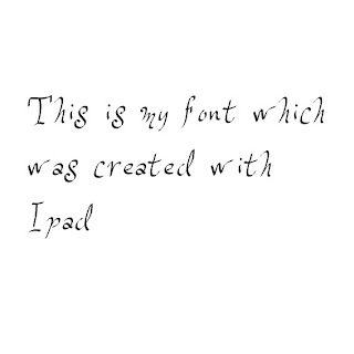
Ipad Font


This is my font i created with the use of iPad. It was much easier than fontstruct because on iPad there was no restrictions  on how you created your font and also you could use your fingers to create the font which gave it a more unique style.
Fontstruct Font


This is my own digitaly made font made by Fontstruct. the program worked with pixels and you had a variety of shapes to choose from to create your font but restricted you by only using one shape per pixel which made it hard to continue my pattern throughout the alphabet with letters such as N and X and Q.
Digital Caligram


This is my hand drawn Caligram which is scanned into the computer to use on adobe illustrator. The letters had a big font and had to be words related to the object in this case i had a camera so i used words such as focus or flash.


This is the finished Digital Caligram that i created  with adobe illustrator. I used the paint bucket in illustrator to colour each word. I used different tones of one colour to add depth and to shows that the object is a camera.


This work was inspired by Oscar Wilson who is widely known for this type of work.

Monday 22 October 2012


Reviewing Experiments


1. Which materials and techniques have you experimented with during the typography project?
    In the typography project I used a whole variety of materials and techniques to recreate our own version of the artist's work we our looking at. I used paints,food,objects and software such as photoshop and illustrator to achieve this.I used food to create words and sayings to see what effect they give on the word and also what it can be used on. I used a variety of paints to paint out expressions in an artisitic form and also see the texture and stroke of the brush. I also used photoshop to create different typography styles by using the wide range of tools photoshop and illustrator have to offer.
2. Have you explored and developed your ideas imaginatively? How have you demonstrated this? (give examples, link to posts or include images) 
3. Have you research a diverse range of artwork and completed this on your blog? who have you analysed? is you analysis in-depth? (again give examples and link to posts) 
4. Have you explored a range of ideas around the theme of 'Sayings and Expressions' within your experiments? What are they? How have they informed your ideas?
5. Have you refined / developed your outcomes through experimentation? How? 
6. Have you annotated, in detail, your experiments and developments on your blog and used this information to help you improve? 
7. Which techniques / experiments have been most successful? Why?
8. Which techniques / experiments have been least successful? Why?
9. Which techniques / experiments will you be developing further for your final outcome? Why? 
10. What else can you do to further develop the techniques / experiments you want to use for your final outcome? 


Sunday 21 October 2012

Hand Drawn Typography


This is my hand painted typography showing the letter B which is inpsired by Tien Min Liao

Friday 5 October 2012

Oscar Wilson Caligram Analysis 


The artwork above was made by Oscar Wilson. Oscar Wilson started doing work in london 1996 specialising in image creation,illustration and hand crafted typography. Oscar wilson produces work for a wide variety of clients which include companies such as, NIKE, Orange, Virgin Atlantic and many other big brands. The artwork was made for the front cover of the book called "The Last Holiday A Memoir" by Gill Scott-Heron. I have chosen this work to analyse because its similar to what i am doing for my work.

Gill Scott-Heron's publisher said the work was "I think Oscar has created an iconic image of Gill and one of that will become widely known and it makes the whole book come together beautifully.
The Genre of this art work is a Caligram typography piece for illustration which was used on the front cover of a book. The subject of the art work seems to be about the person on the cover and his life story.The title "The Last Holiday A Memoir" shows that its about the person on the cover who is remembering a holiday he had and having difficulty forgetting about assuming it was something terrible that happened in the holiday.

This artwork was made with Adobe Illustrator and some of it hand drawn with different font sizes and font types on a white background.Oscar wilson uses a limited amount of colour but gives the effect of highlights and shadows on the face.

I chose this peice of art work because it intrigued me to find out how it was created because it looked realisitc. I also like how the artist uses only a limited amount of colour but still gets a realistic effect and it suits the cover ofthe book its designed for.
Gil Scott-Heron's Publisher and friend Jamie Byng said of the work: “I think Oscar has created an iconic image of Gil and one that will become widely known and it makes the whole book come together beautifully

Sunday 30 September 2012

Digital vs Handmade - Clipping masks


This was made with photoshop and photobooth to create a picture within a letter by using clippnig masks in photoshop and adding different effects to the picture which was inspired by M&M Paris            


Digital vs Handmade - Watercolour


 photoshop made font with watercolour effect inspired by Natsuki Otani


Back to Basics Work


Grassy W made with brushes in Photoshop


Letter W made with pin and thread


The handmade font on photoshop
was much easier than the pin and thread which needed more time to construct and have steady hand to build up the letter. these to excercises were inspired by 


Wednesday 26 September 2012


 These our my groups typography we made using Flowers,Rulers,Masking tape and push pins which was inspired by Vladimir Koncar


An example of Vladimir Koncar's typography made out of toothpicks